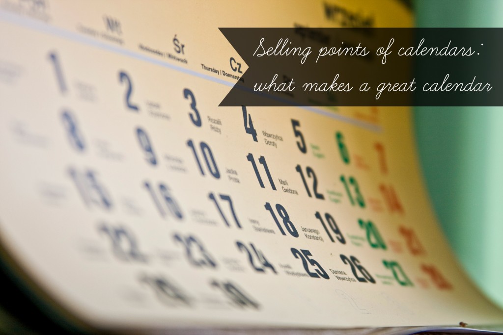
You can find calendars everywhere. The iGoogle Homepage, student agendas, the bank, cellphones, and most homes all contain calendars. Many companies give out free calendars to promote their businesses and organizations: I’ve collected these from the Heart & Stroke Foundation of Canada, World Vision, and VitaHealth among others. But just because there are a lot of calendars out there, doesn’t mean they are all good quality calendars.
What makes a great calendar?
Good quality is a rather vague term because it is really dependent on what exactly you’re looking for in a calendar. The basic information includes the dates and the weekdays in a chart with the name of the month printed above. Calendars are often clean and tidy with neat boxes that line up with one another.
Smaller calendars might have just the date and nothing else in the box; these ones are specifically for knowing the bare minimum of the date and day of the week for that month. But I prefer bigger calendars, the kind with larger boxes so that you can write in your own schedule. In a way, these calendars cease to just be calendars, and instead become organizers or daily planners.
These bigger calendars are also useful if we wish to know the phase of the moon or if any holidays are coming up in the next couple of weeks. These small extras contribute to our desire to have as much information as possible all in one place. The consumer will feel more as though they are getting their money’s worth if the calendar provides them with more information, even if it is information that they will never pay attention to.
Aesthetic appeal is equally important. Calendars that appear sloppy and unorganized will likely be overlooked by one which displays a more professional layout. Likewise, pictures and text can also increase the likelihood that you will buy one calendar over another. For instance, two female roommates might decide to invest in a James Dean calendar featuring a different classic photograph of James Dean for each month. Likewise, if they are travelers, they would probably also be interested in a calendar such as the “1,001 places to visit” calendar, which is graced with beautiful color photographs and snippets of information about the places that the calendar urges travelers to visit. Organizations that are affiliated with health and nutrition might feature recipes and photographs of the finished product in their calendars, a sure seller as each recipe tends to be associated with the kinds of foods available at that time of year.
The kind of material that the calendars are printed on, and the typography and the fonts, will all be variants in how much someone might like to have the calendar on the wall. It might seem a silly thing to take into consideration, but this calendar will be hanging on your wall—and likely in a very prominent place—all year long. What do you want to be associated with? What do you want to look at day after day?
The key to selling the calendar, then, is to be timely and to know who the audience is that are being targeted. The last component to the making of a successful calendar is contact information: if your calendar is as good as you hope consumers will believe it to be, you want to make sure that they know where to reach you so that they will buy into more of your business.
